code · · 7 min read
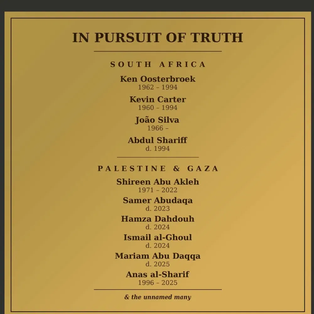
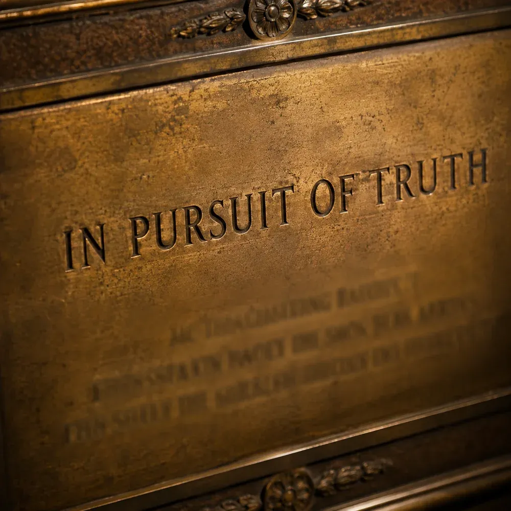
There’s a test I kept coming back to while I was building thetoll.memorial: would this feel appropriate carved into stone? It’s a stupid question to ask about most software. You wouldn’t ask it of a project management tool, or a landing page, or a shopping cart. But the site is a memorial for journalists, photographers, medics, aid workers, and fixers killed in conflict zones, and at some point it became the only question that mattered.
The moment I started using that test, most of what I’d normally do as a web developer stopped being optional. It wasn’t that the choices got harder. It was that the choices got fewer, and the ones that remained mostly took the shape of things I wouldn’t do.
The defaults of the modern web are well-rehearsed, and anyone who’s spent enough time around the medium can reel them off. Add analytics. Add a share button. Make it feel alive. Pick a warm accent colour. Animate the hero. The rituals. For most sites this is fine, because most sites aren’t about anything that resists the rituals. A memorial does resist. It asks, again and again, whether each ritual is a claim you’re prepared to make about the people named on the page.
I thought I was building a website. I ended up keeping a list of what didn’t go on it, and that list is, more than anything else, the project.
This is the list, roughly in the order I wrestled with the items:
No analytics. Not even the privacy-respecting kind. No counting of page views, no session tracking, no heatmaps. If someone comes to the site to stand with a name for a minute, I don’t want to know they came. The act of counting would turn mourning into metrics and a visitor into a unit. Carved in stone doesn’t phone home.
No social sharing buttons. The visual grammar of the share button is the grammar of promotion. A name on a memorial is not a thing to be shared. If someone wants to send the URL to someone else, they can copy it. The friction is the point. Anything that invites one-click amplification trains people to treat the content as content rather than as a person.
No donate button. There are good organisations working on press freedom and conflict protection, and I’d like people to support them. But a donate button on a memorial is a tell. It says we are here, in part, to extract something from you. I’d rather the site extract nothing, and trust people to find the organisations themselves if they want to.
No comments, no condolences, no guest book. I understand the impulse; people want to participate. But moderation would be a second job, and an unmoderated comment field on a memorial will get worse over time, and the quiet presence of a name is already participation enough. The dead don’t need another scroll of reactions.
No animation. No fade-ins, no parallax, no scroll-triggered effects. The tools are right there and they are, in the context of a landing page, fine. On a memorial they produce the uncanny feeling that the dead are performing for you. The page loads, the content is there, and it behaves like an object rather than an event.
No light mode. Dark ground, gold serif, generous whitespace. It isn’t a design preference; it’s an acknowledgement. A light-theme toggle would suggest the experience is tunable, that you can adjust the mood to suit your reading habits. You can’t. The atmosphere is the statement. If you prefer a brighter interface, that isn’t something the memorial is built to accommodate.
No third-party anything. No CDN that tracks, no Google Fonts, no embedded tweets, no hosted analytics even when disabled. Everything is self-hosted and static. The site makes no network requests the visitor didn’t explicitly ask for. This is partly a privacy stance and partly a symbolic one. The names on the page should not be incidentally cross-referenced with someone’s ad profile while they read.
No search, no filters, no sorting. You can’t rank the dead by country, or sort by year, or filter by profession. The list isn’t a dataset. Each person gets the same amount of space regardless of how famous the case was, how well-documented the death, or how many languages the name was written in. You land on the list and you scroll. That’s the interaction.
It would be easier to have written a list of what I did build. It’s a shorter list.
Every item above started as an argument I had to have with my own defaults. Every item is a thing that, in any other project, I would have added without thinking. And the more I crossed off, the more I noticed what the crossings-off had in common.
Analytics, share buttons, donation prompts, comments, animations, themes, embeds, search. These aren’t neutral features. Each one is a small claim about what the site is for. Analytics claims the site exists to be measured. Share buttons claim it exists to be distributed. A donate button claims it exists to convert. Comments claim it exists to host reaction. Animation claims it exists to entertain. A theme toggle claims it exists to be personalised. A search box claims it exists to be queried.
None of those claims are ones I wanted to make about a page of names. So the refusals weren’t really aesthetic. They were a form of argument. The memorial says, through what it doesn’t do, that it exists to hold space. Nothing else.
I think this is what it means when people talk about design as ethics, and it’s why the phrase has always felt a little wafty until I tried to actually do it. Ethics isn’t in the accent colour or the typeface. It’s in the features that almost went in and didn’t. It’s in the defaults you noticed and refused. Constraints aren’t a limitation on the statement; constraints are the statement. What remains after the crossings-off is the claim you were willing to make.
Before I close this out, one thing I should say. I’m not a designer. I’m not a website designer, I’m not a graphic artist, and my aesthetic sense mostly consists of knowing what I like when I see it. Left to my own defaults, I’d have produced a site that looked vaguely correct and felt slightly off, which is a particularly bad outcome for a memorial.
The reason the site doesn’t feel slightly off is that I didn’t do it on my own. I worked through the spec, the drafts, and the implementation with Claude Code as a collaborator. The thing I kept noticing was that the model understood the brief. Not in a surface sense of matching requirements to output. In the sense that it picked up the emotional register of the project and held it steady, session after session, without me having to nudge it back into place.
There’s a lazy perception of AI coding agents as code monkeys: useful for churning out boilerplate, useless for anything that needs judgement about what a thing is for. That wasn’t my experience here. I’ve watched Claude Code apply the carved-in-stone test to features I hadn’t thought to question, and resist defaults I was sliding toward out of habit. The restraint in the final site is partly mine and partly the model’s, and I don’t think I could cleanly separate the two contributions if I tried.
This is probably a story for another post. I mention it here because the argument of this one rests on the refusals, and I didn’t hold the carved-in-stone test on my own.
Once you read a site this way, it’s hard to stop. Most sites are loud about what they’re for, and most of them are for conversion, retention, engagement. That’s fine; it’s what most sites actually are for. It gets interesting when the features don’t match what the site claims to be about. A personal blog smothered in newsletter popups isn’t really saying I have something to say. A nonprofit covered in donation prompts isn’t really saying this cause matters. The refusals would have been the argument.
I’m not pitching memorial-style restraint for anyone else. Most things don’t need it. But the question generalises: what is this actually for, and which of the features I’m adding work against that?
thetoll.memorial is a small site. It will never be a product. Nobody will optimise it for engagement, and nobody will A/B test the typeface. It exists to list names, and to list them with the weight that the names deserve. Every feature that isn’t there is a promise about what the site will not do to the people it remembers.
Would this feel appropriate carved into stone? It’s a stupid question to ask about most software. It’s also an interesting discipline to try.